
MOBILE APPLICATION DESIGN
Link2Care

A mobile application designed to bridge the gap between access to support and services for non-professional caregivers.
Jess Southey, Kate Hawken, Olga Peshkova and Mana Asif | Timeline: 3 weeks | 2021
Overview
Background
Link2Care is a mobile app that connects non-professional caregivers to a community of caregivers in similar circumstances, as well as to industry professionals who can provide support, resources and advice related to caregiving.
For the purposes of this Case Study, we aimed to create a mobile application solving the painpoints
DEFINITIONS
Caregiving is a broad and diverse industry with many different levels.
For this case study Professional Carers relates to an umbrella term for two groups:
-
- Professional carers that work in facilities such as hospitals and aged care ie. nurses, disability services, support workers, physiotherapists, etc.
- The second group of professional caregivers relates to those that work freelance or by contract with agencies, who provide in-home care to patients at their residence on a part-time or full time basis.
Non-professional Carers are defined as family members who have taken on care of a loved one. They often work in an external job to support themselves and their families as well as juggling multiple commitments while providing full-time care at home.
*Please note that throughout this case study carer and caregiver may be used interchangeably.
TEAM
Jess Southey
Kate Hawken
Olga Peshkova
Mana Asif
TOOLS USED
User Interviews, Affinity Diagrams, User Personas, User Journey Maps, Feature Prioritisation Matrix, Storyboards, User Flow, Wireframes, Low-Mid Fidelity Prototypes, Figma, InVision, Adobe XD
TIMELINE
3 Weeks
Professional Carers
Hired in the Industry:
Trained Nurses, physiotherapists, working in hospitals, aged care facilities etc.
Professional Carers
Freelance or Agency:
Support workers, nurses providing in-home care on part-time or full time basis.
Non-Professional Carers
Family Members:
Family members who have taken on care of a loved one with little to no professional training.
LOW ON TIME?
Jump to the Best Bits!

Rethinking Information Architecture
Implementing Navigation Redesign

Clickable Hi-Fidelity Prototypes
DISCOVERY
The Challenge
Determining the purpose of AWE
The Problem
Non-professional caregivers who care for family members who may be elderly, disabled and otherwise dependent are often isolated and overwhelmed in their roles due to the inherent lack of support structure as a caregiver who is not associated with a professional role.
As caregivers; caring for themselves is often a low priority and they have little time or motivation to seek support externally for themselves while juggling multiple commitments. Non-professional caregivers need more access to tools to help them find support and communicate with those in similar situations in order to get advice, share resources and relieve stress so they can better care for themselves and others.
The Solution
DESIGN PROCESS
Timeline and Process
We completed an iterative design process over a three week period with the following major steps:
Discovery
- 4 User Interviews
- 15 Survey Responses
- User Persona
- Empathy Map
- Affinity Diagram
Definition
- User Insight and Problem Statement
- Competitor Analysis
- Feature Prioritization Matrix
- User Flow Diagram
Development
- Low-Fi Wireframes
- Low-Mid Fidelity Clickable Prototypes
- 2 Rounds of Remote Usability Testing on Low-Fi and Mid-fi Prototypes
- Feedback Analysis
Delivery
- Hi-Fidelity Prototype
- Iterated Prototypes after final round of Usability Testing
DISCOVERY
User Research
User Interviews and Surveys
Entering into our research phase, we began with the assumption that non-professional caregivers would be tired, overwhelmed and need more support.
The results we got from our 4 interviews and 15 survey responses amplified this assumption in surprising ways however, as they highlighted the real-world complexities of caregiving and how challenging the situation can be for many non-professional caregivers.
In the surveys, many Non-Professional Carers expressed that they had limited people to speak to and at times didn’t know who to turn to for help. While they took advice from GP’s and sometimes facebook groups many of them only had family and friends to turn to, most of which they didn’t want to burden with their problems or felt they didn’t truly understand.
User Interviews
Professional Carers
Non-Professional Carers
Survey Responses
Major Findings from User Interviews
From our interviews, it became clear that roles between the caregivers differed greatly, and therefore so does their access to resources and support.

Job Security
We found that our professional caregivers chose to enter the industry as a career choice. They are paid, have job benefits, job security, as well as having the ability to switch off at the end of the day to manage external commitments after a challenging day with clients.
Our non-professional carers by contrast are usually caring by necessity, being the only family member that can take on the care. They are usually juggling multiple commitments such as work, family, social and day-to-day activities.
Access to support and training
We noticed a large disparity between access to support services between Professional and Non-professional carers.
Professional caregivers have access to support through colleagues, industry psychologists, mentors and superiors. Training and education vary among professional carers but most are working in line with their qualifications and have access to continue to learn and grow through opportunities at work.
On the other hand, many non-professional caregivers have little to no access to support or training. Many begin their caring role with the expectation that they know their loved one personally and therefore know how to care for them but then begin to struggle with the increasing complexity of their needs.

Managing external commitments and self-care
Our non-professional caregivers rarely prioritise seeking support for their own well-being even though they are often dealing with a complex range of emotions on a personal level including grief over their loved ones situation, changes to family dynamics and stress.
Additionally, they are often the main point of contact for their loved ones emotional well-being. This requires more boundary setting and a need for self-care. However, they often feel guilty about taking time for themselves or don’t prioritise it until a third party encourages them to do so.
Our goals for Link2Care
Based on these insights, we decided to prioritise the non-professional caregiver as our primary user to shift our focus to help them access the same level of support that professional caregivers have access to.
We also understand that no two patients being cared for, even with the same illness or disability require the same level of care, so providing opportunities for carers to reach out to a broad audience and find specific advice among professionals and others in similar situations became an important focus for our research and further development.
After we collected our user insights from our survey and interview responses, we were able to clearly group areas of concerns for our caregivers and discover which problems needed to be solved in our design process, this included:
- The lack of avenues to access support for non-professional caregivers
- The feeling of being overwhelmed, emotionally challenged and isolated
- Low motivation to prioritise their own health and well-being or deal with stress
- Unable to find reliable advice or resources
- Limited access to caregivers in similar situations
- Not knowing who to speak to outside of their primary doctor
Inconsistent Navigation
Users struggled to use the navigation to complete tasks as the menu titles were not intuitive for the information they were seeking
Confusing User Journey
Users were directed to external websites for most of the information they were seeking, making it difficult to find their way back or recall how they got to the information.
Uncertainty about Purpose
The initial idea users had about what the Department’s purpose was and what they may find on the site became further obscured the longer they used the website.
Difficult, disjointed design
Users found the design cold and outdated, found the use of cards for navigating major topics confusing, found the primary navigation bar was unhelpful/incomplete, inconsistent use of alphabetisation, lack of filtering.
DEFINITION
Information Architecture
Card Sorting
A card sorting activity was undertaken to collect all the existing pages on the AWE website, as well as essential topics and pages from agriculture.gov.au and environment.gov.au to prioritise information and determine which may be more intuitively placed for the user. We determined that each major category should have it’s own section in the navigation, with a comprehensive drop down list for each, to reduce the amount of in-page sub-navigation and make lists that are easy to scan.

As you can see, there was an extensive amount of information that needed to be merged onto this new site. We determined 8 major categories for the primary navigation –
-
- Home
- About Us
- News and Media
- Agriculture
- Water
- Environment
- Heritage, Land and Parks
- Science and Research
Sitemap
From our card sorting we were able to implement our new information architecture into logical primary and secondary and tertiary sub-categories to inform our primary and secondary navigation structures and the flow of the website on both desktop and mobile.
Hierarchy Breakdown:
We chose to keep the items on the navigation in order of users needs:
Much of our feedback indicated that users did not understand the purpose of the site, so ‘About Us’ has been restructured and given first spot on our Primary Navigation.
Due to many of the resources on the original site being geared towards media and journalists, we maintained the position of ‘News and Media’ as high priority in the navigation in second place, followed by ‘Agriculture’, ‘Water’ and ‘Environment’ in order of the acronym AWE to promote recognition and familiarity of placement.
We also heroed other topics that were scattered over the websites into their own dedicated categories – ‘Heritage, Land and Parks’ and ‘Science and Research’.

DEVELOPMENT
Low-Fidelity Desktop Wireframes
Our Low-Fi Desktop Wireframes included the application of our redesigned navigation, hierarchy considerations for the homepage layout, the use of cards, white space and identifying sections and footer designs.


DEVELOPMENT
Low-Fidelity Mobile Wireframes
Our mobile wireframes required extra consideration with how to present the content in a way that was easier to navigate on smaller devices, reducing the card sizes to a smaller size or converting to a button style for topic navigation, maintaining hierarchy of sections like news and media while reducing others like social media and footer into drop downs


DEVELOPMENT
Style Guide/Style Tile
We created an extensive Style Guide for this website that included components, modules and design requirements for all major elements of our website, including breadcrumbs, pagination, card and image styles, typography, dropdowns, buttons, checkboxes and search fields among many others. Here you can see a summary of our main design choices on our Style Tile:

Original Navigation from AWE

The original AWE website contained very few topics in the primary navigation which made it very difficult for users in our tests to find information on the website and complete the tasks. Users struggled to understand the purpose of the website without the major topics represented and found the ‘Ministers’, ‘Online Services’ and other links in this section linked to external websites with no way back.
Our Proposed Redesign

In developing our navigation we focused on:
- Clearly displaying major topics on the primary navigation bar
- Improving the overall design by creating a modern, clean interface
- Creating a global navigation bar at the top of the page for the transition during the merger to access the currently active Agriculture and Environment websites as well as Contact, Ministers and Online Services.
- Clearly indicated with an icon that ‘Online Services’ would take you to a different website, as well as Agriculture and Environment by displaying the full url. Our proposed redesign would also encourage the Ministers page to be part of this website.
Facilitating Recognition
Each section was colour coded on hover and this colour was maintained for this topic throughout the site for easy recognition.

Creating Consistency
Dropdown menus for each navigation topic were all composed of 4 sections with similar title structures so users could recognise where they might find similar information under each section; eg. ‘Grants and Funding’ will always be found under support and information for each particular category.

See it in action:
DEVELOPMENT
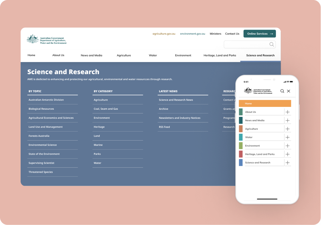
Applying the Mobile Navigation Redesign
Original Navigation from AWE

Our Proposed Redesign
Our redesign for mobile was one of our most important considerations in this responsive process. How could we maintain the same experience and level of recognition that users are used to on the desktop version while keeping the large amount of subcategories accessible and compact?

To achieve this we maintained the colour coding users will be accustomed to from the desktop website and created dropdown options for each.

Once the user has selected their topic, our organisation of sub-categories aims to be self-explanatory to the average user.
DEVELOPMENT
Responsive Design
Full consideration of responsive design was top priority throughout our design process, especially given the large amount of information that needs to be accessed throughout the site. We aimed to create a seamless experience across mobile and desktop that ensured users could always recognise the information across all platforms.
Desktop

Mobile

Responsive Cards
We prioritised a list of frequently used services from all three websites on the homepage and included a search bar for ease of completing frequent tasks or discovery of services for casual users. Cards were maintained on mobile in a 2×5 grid.
Desktop

Mobile

Responsive Topic Navigation
The desktop topic navigation cards include more information about each section of the website, when reduced to mobile these cards reduce to a smaller button size that only occupies the view height of the screen size.
DEVELOPMENT
Testing and Iterating
Throughout our user testing process, frequency of response charts were maintained, giving us a good visual indicator of positive responses from our users from our first and second usability tests on the main websites web and mobile versions, to our final usability test on our high fidelity mobile prototype.
7 remote user tests were completed with our clickable mobile hi-fidelity prototype.
We appreciated the positive changes we saw in our users’ interaction with our prototype, the ease of use of our navigation systems and their ability to recognise where they were on the site at all times.
In our final test plan, we decided to retest the aspect our users found most difficult from the original usability tests on the AWE website; including a task to find ‘Communiques’. We were pleased to see that many users were able to navigate to this section with ease after our changes were made, while there is still some question of the use of jargon that we would like to test further with those working in the media industry.
After testing our prototypes we performed 5 Second tests on our homepage after the style guide was applied to determine the overall application of the design and hierarchy of sections.
We got many valuable insights and positive feedback on the clarity of the design, almost all users said the mobile version was professional and neat and the hierarchy was understandable and intuitive. The bulk of our iterative feedback was to do with phrasing, recognition of acronyms and keeping the buzzwords at the beginning of lists for easy scanning. We were able to apply these to our final iterations on both mobile and desktop.
DELIVERY
Hi-Fidelity Desktop Prototype

View our Clickable Desktop Prototype
Hi-Fidelity Mobile Prototype
Interact with our final Hi-Fidelity Mobile Prototype. See how we solved the navigation to make it succinct on mobile and the responsive layout design compared to the desktop version.
Thank you for your time!
Would you like to discuss this case study further?