
DESKTOP AND MOBILE REDESIGN
AWE Responsive Redesign

A complex merge of two large government websites with a focus on information architecture to create a comprehensive navigation system, improve the overall design and increase user understanding of the purpose of the website.
Jess Southey and Livio Petrosino | Timeline: 5 weeks | 2021
Overview
Background
The Department of Agriculture, Environment and Water (AWE), is a newly established department as of 2020 that was previously two separate departments;
- The Department of Agriculture (www.agriculture.gov.au)
- The Department of Environment and Energy (www.environment.gov.au)
The website is currently being updated to reflect the merge of these two websites on www.awe.gov.au.
For the purposes of this Case Study, we aimed to continue the synthesis of both these websites into a modern and more user-centered website and improve navigation and ease of use.
TEAM
Jess Southey
Livio Petrosino
TOOLS USED
Figma, Miro, Heuristic Evaluation, Proto-Persona, Affinity Diagram, Card Sorting, Frequency of Response Table, 2×2 Matrix, Remote Usability Testing
TIMELINE
5 Weeks
Please note:
This project was completed as a Case Study as part of our UX/UI Certificate, the views expressed are in no way associated with the views of the Australian Government.

awe.gov.au

environment.gov.au

agriculture.gov.au
LOW ON TIME?
Jump to the Best Bits!

Rethinking Information Architecture
Implementing Navigation Redesign

Clickable Hi-Fidelity Prototypes
DISCOVERY
The Challenge
Determining the purpose of AWE
AWE aims to protect Australia’s natural resources, help develop strong agricultural industries, manage land and heritage, and conduct research to benefit Australian communities and assist government and industry.
Our biggest challenge initially was determining what the AWE website was trying to achieve. With three currently functioning websites, the information and objectives were scattered and the merge of the information on the new AWE website remained incomplete. We quickly realised most links from this website linked back to the Agriculture and Environment websites with no clear path back or indicator that you were leaving the site.
Our initial assumption about the purpose of the site prior to heuristic evaluation was that it would be geared towards users looking at environmental issues, educating the public and discussing new legislations, but we quickly learned that it was geared more towards industry professionals seeking permits and media personnel gaining access to resources.
The Problem
The website’s outdated and clinical design, in conjunction with the challenges of an incomplete and large interdepartmental merger left users faced with navigating insurmountable volumes of content with inconsistent navigation systems, inability to find content and a confusing experience on the site.
The Solution
We aimed to create a responsive redesign that was clean, modern and functional that prioritised users ability to navigate between major topics overseen by the Department. We determined hierarchies based on our anticipation of what users would interact with the most, ease of access to common tasks and information that was a high priority for AWE. Based on our usability testing feedback on our final design, we created a more positive experience overall by enhancing opportunities for consistency, recognition and flexibility of use.
DESIGN PROCESS
Timeline and Process
Discovery
- Heuristic Evaluation
- Proto-Persona
- User Testing
- Affinity Diagram
- Frequency of Response
- 2×2 Matrix
Definition
- Mood-board
- Card Sorting
- Sitemap
- Style Guide
Development
- Homepage and Navigation Low-Fi Wireframes
- Mobile and Desktop Wireframes
- Style Guide
- 5 Second Test
- Clickable Prototype Usability Testing
Delivery
- Hi-Fidelity Prototype
- Iterated Prototypes after final round of Usability Testing
DISCOVERY
User Research
Heuristic Evaluation and Redlining
To better understand the existing AWE website we conducted a heuristic evaluation. Here we combed through the site annotating and redlining key information spanning content, functionality, user feedback and nuances within the websites interactivity.
Some of our key findings included inconsistencies in text font, link styles and card sizes and design, as well as use of jargon and poor navigation structure, all of which were negatively impacting users in our first round of usability testing.

Usability Testing and Affinity Diagrams
Desktop Usability Tests
Mobile Usability Tests
Our participant pool was focused on lay-people with no connection to the industries related to the department or previous use of the site to determine what the experience of the website was like for every-day Australians seeking environmental information and news.
We directed participants through a series of 3 tasks related to navigation and finding documentation throughout sections of the existing AWE website. We synthesised our results into an Affinity Diagram to identify common responses and pain points in order to decide which elements to prioritise in our redesign.
Major Findings from Usability Tests
Inconsistent Navigation
Users struggled to use the navigation to complete tasks as the menu titles were not intuitive for the information they were seeking
Confusing User Journey
Users were directed to external websites for most of the information they were seeking, making it difficult to find their way back or recall how they got to the information.
Uncertainty about Purpose
The initial idea users had about what the Department’s purpose was and what they may find on the site became further obscured the longer they used the website.
Difficult, disjointed design
Users found the design cold and outdated, found the use of cards for navigating major topics confusing, found the primary navigation bar was unhelpful/incomplete, inconsistent use of alphabetisation, lack of filtering.
DEFINITION
Information Architecture
Card Sorting
A card sorting activity was undertaken to collect all the existing pages on the AWE website, as well as essential topics and pages from agriculture.gov.au and environment.gov.au to prioritise information and determine which may be more intuitively placed for the user. We determined that each major category should have it’s own section in the navigation, with a comprehensive drop down list for each, to reduce the amount of in-page sub-navigation and make lists that are easy to scan.

As you can see, there was an extensive amount of information that needed to be merged onto this new site. We determined 8 major categories for the primary navigation –
-
- Home
- About Us
- News and Media
- Agriculture
- Water
- Environment
- Heritage, Land and Parks
- Science and Research
Sitemap
From our card sorting we were able to implement our new information architecture into logical primary and secondary and tertiary sub-categories to inform our primary and secondary navigation structures and the flow of the website on both desktop and mobile.
Hierarchy Breakdown:
We chose to keep the items on the navigation in order of users needs:
Much of our feedback indicated that users did not understand the purpose of the site, so ‘About Us’ has been restructured and given first spot on our Primary Navigation.
Due to many of the resources on the original site being geared towards media and journalists, we maintained the position of ‘News and Media’ as high priority in the navigation in second place, followed by ‘Agriculture’, ‘Water’ and ‘Environment’ in order of the acronym AWE to promote recognition and familiarity of placement.
We also heroed other topics that were scattered over the websites into their own dedicated categories – ‘Heritage, Land and Parks’ and ‘Science and Research’.

DEVELOPMENT
Low-Fidelity Desktop Wireframes
Our Low-Fi Desktop Wireframes included the application of our redesigned navigation, hierarchy considerations for the homepage layout, the use of cards, white space and identifying sections and footer designs.


DEVELOPMENT
Low-Fidelity Mobile Wireframes
Our mobile wireframes required extra consideration with how to present the content in a way that was easier to navigate on smaller devices, reducing the card sizes to a smaller size or converting to a button style for topic navigation, maintaining hierarchy of sections like news and media while reducing others like social media and footer into drop downs


DEVELOPMENT
Style Guide/Style Tile
We created an extensive Style Guide for this website that included components, modules and design requirements for all major elements of our website, including breadcrumbs, pagination, card and image styles, typography, dropdowns, buttons, checkboxes and search fields among many others. Here you can see a summary of our main design choices on our Style Tile:

Original Navigation from AWE

The original AWE website contained very few topics in the primary navigation which made it very difficult for users in our tests to find information on the website and complete the tasks. Users struggled to understand the purpose of the website without the major topics represented and found the ‘Ministers’, ‘Online Services’ and other links in this section linked to external websites with no way back.
Our Proposed Redesign

In developing our navigation we focused on:
- Clearly displaying major topics on the primary navigation bar
- Improving the overall design by creating a modern, clean interface
- Creating a global navigation bar at the top of the page for the transition during the merger to access the currently active Agriculture and Environment websites as well as Contact, Ministers and Online Services.
- Clearly indicated with an icon that ‘Online Services’ would take you to a different website, as well as Agriculture and Environment by displaying the full url. Our proposed redesign would also encourage the Ministers page to be part of this website.
Facilitating Recognition
Each section was colour coded on hover and this colour was maintained for this topic throughout the site for easy recognition.

Creating Consistency
Dropdown menus for each navigation topic were all composed of 4 sections with similar title structures so users could recognise where they might find similar information under each section; eg. ‘Grants and Funding’ will always be found under support and information for each particular category.

See it in action:
DEVELOPMENT
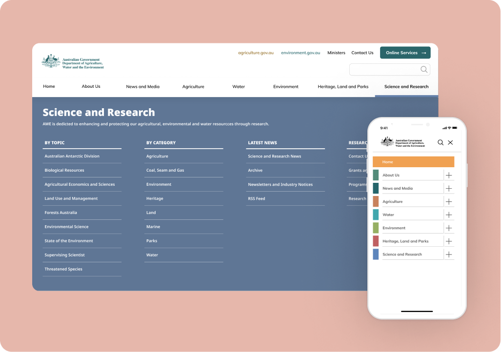
Applying the Mobile Navigation Redesign
Original Navigation from AWE

Our Proposed Redesign
Our redesign for mobile was one of our most important considerations in this responsive process. How could we maintain the same experience and level of recognition that users are used to on the desktop version while keeping the large amount of subcategories accessible and compact?

To achieve this we maintained the colour coding users will be accustomed to from the desktop website and created dropdown options for each.

Once the user has selected their topic, our organisation of sub-categories aims to be self-explanatory to the average user.
DEVELOPMENT
Responsive Design
Full consideration of responsive design was top priority throughout our design process, especially given the large amount of information that needs to be accessed throughout the site. We aimed to create a seamless experience across mobile and desktop that ensured users could always recognise the information across all platforms.
Desktop

Mobile

Responsive Cards
We prioritised a list of frequently used services from all three websites on the homepage and included a search bar for ease of completing frequent tasks or discovery of services for casual users. Cards were maintained on mobile in a 2×5 grid.
Desktop

Mobile

Responsive Topic Navigation
The desktop topic navigation cards include more information about each section of the website, when reduced to mobile these cards reduce to a smaller button size that only occupies the view height of the screen size.
DEVELOPMENT
Testing and Iterating
Throughout our user testing process, frequency of response charts were maintained, giving us a good visual indicator of positive responses from our users from our first and second usability tests on the main websites web and mobile versions, to our final usability test on our high fidelity mobile prototype.
7 remote user tests were completed with our clickable mobile hi-fidelity prototype.
We appreciated the positive changes we saw in our users’ interaction with our prototype, the ease of use of our navigation systems and their ability to recognise where they were on the site at all times.
In our final test plan, we decided to retest the aspect our users found most difficult from the original usability tests on the AWE website; including a task to find ‘Communiques’. We were pleased to see that many users were able to navigate to this section with ease after our changes were made, while there is still some question of the use of jargon that we would like to test further with those working in the media industry.
After testing our prototypes we performed 5 Second tests on our homepage after the style guide was applied to determine the overall application of the design and hierarchy of sections.
We got many valuable insights and positive feedback on the clarity of the design, almost all users said the mobile version was professional and neat and the hierarchy was understandable and intuitive. The bulk of our iterative feedback was to do with phrasing, recognition of acronyms and keeping the buzzwords at the beginning of lists for easy scanning. We were able to apply these to our final iterations on both mobile and desktop.
DELIVERY
Hi-Fidelity Desktop Prototype

View our Clickable Desktop Prototype
Hi-Fidelity Mobile Prototype
Interact with our final Hi-Fidelity Mobile Prototype. See how we solved the navigation to make it succinct on mobile and the responsive layout design compared to the desktop version.
Thank you for your time!
Would you like to discuss this case study further?